Creating a Final Illustration
This summer I was interviewed by Charlene Chua of PictureBookers. Charlene is a prolific and accomplished illustrator which enables her to think of really interesting questions to ask. I had a lot of fun doing this interview. Have a read, I think you'll enjoy it, too!
In the piece I was asked to give a bit of an overview of my illustration process and the tools I use. I get a loooooooot of questions about media and process when I talk and teach so I thought I'd go into a little more detail here for you. We're just going to cover final art here (I'll take you through the full illustration process from concept to final in a later post.)
This example is from my book White as Milk, Red as Blood: The Forgotten Fairy Tales of Franz Xaver von Schönwerth (Knopf). Many people think these are watercolor paintings but they're not. WHAAAAATTTT?!? That's right. I use a combination of traditional and digital media to reach this effect. Here's a rundown of what that process looks like.
PROCESS
Once I've got approval to go to final from my Editor or Art Director I begin by creating the line work. Using a light desk and a regular old pencil I trace the approved rough illustration onto my final paper. I refine the details in pencil until I'm happy with how it's looking, usually while looking up reference and simultaneously listening to podcasts. (I'll post some of my favorites, soon.)
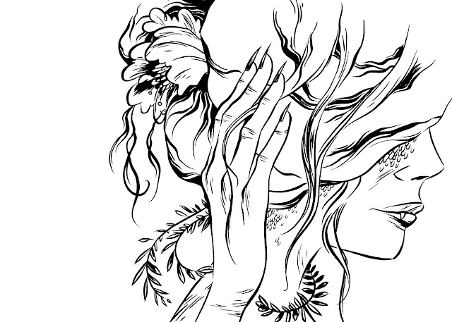
Now it's time to ink. I use Speedball India Ink and small watercolor brushes size 000 on Canson Mix Media paper, 138lb to create the line work.
I scan this drawing in the bitmap mode. On some scanners it's called "black and white" on others it's called "bitmap." In the bitmap mode there is only black or white, no grey, which means there's no smoothing of the lines. Print resolution is 300dpi but you must scan at a minimum of 600dpi to preserve your line work in the "bitmap" or "black and white" setting. Otherwise your beautiful lines will look pixellated. Trust me. Here's what the line work looks like after it's scanned in.

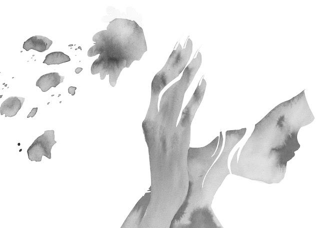
I paint the washes onto a separate piece of paper so that it can be scanned as it's own layer. I use the same ink and paper as above but with a thicker brush.
First, I trace the final line work onto a fresh sheet of paper at the light desk. I fill in one area at a time with water then drop ink in using the brush. I use the wet on wet watercolor technique a lot to get the desired effect.
I scan the washes at the same resolution as my line work using the "greyscale" setting. This preserves the delicate watercolor-like look of the ink washes. Here's what they look like:

From this point on I'm working digitally.
In Photoshop I create a new RGB file in the same high resolution in which everything was scanned.
I drop the line work in first, then delete all the white areas so that only the black lines are left. This enables me to colour the line work separate from everything else.
I drop the washes in next under the line work layer. You may want to have some paper texture behind the drawing but I like the white areas to be completely white so I delete those areas completely.
Depending on what type of effect I want the washes to have in relation to the colors I will use either the "overlay," "screen," or "multiply" settings in the Layers menu. Experiment and see what you like best.
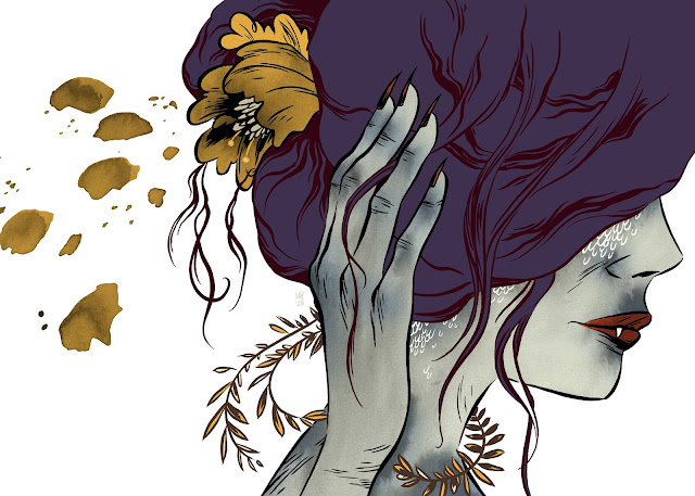
Finally I color the artwork. I color in separate layers below and above my washes, depending on how I want it to look.
Here's the final piece:

Once complete, the final art is then changed from RGB to CMYK and the dpi is adjusted to print resolution, which is 300dpi. For some reason it's ok to lower the resolution once it's in RGB or CMYK but NOT when it's still in the bitmap setting.
In most cases print specs are 300dpi CMYK, but it's always best to check with your client or publisher to be sure you're creating the artwork to their specifications.
Once the artwork is complete it's sent off to the client. They will sometimes ask for a small revision, but at this stage it should only be to the colors or something suuuuper minimal that's easily changed without affecting the rest of the drawing.
Hope this was helpful! I'll go into more detail on other aspects of the illustration process on this blog at a later date so keep your eyes peeled!
And finally, here are the sites I mentioned above:
PictureBookers: an excellent resource for anyone interested in illustrating for children.
I'm a HUGE fan of Charlene Chua's work. Check it out here!
My book: White as Milk, Red as Blood (Knopf)


